Transit Data Primer


The goal of this website and downloadable presentation is to provide a framing around the use of large automated datasets in transit decision-making and give transit advocates tools and questions to ask about the data agencies are using.
Contents
Data-informed decisions in transit
Transit agencies are awash in automated data from every tap of a fare card on a subway gate to every “ping” of a bus location. All that data can make it easier to answer some types of questions, but too much focus on big data can obscure the purpose of a decision-making process. Transit plans, policies, and performance measures have to start with values and experience that come from people, not automated systems.
This website is designed to explain the types of data that transit agencies use, how they are useful, their limitations, and what questions to ask about quantitative data analysis.
Note: All of the data used in this website is for illustrative purposes only!
Data-informed
People frequently promote ‘data-driven decision-making’, but decisions should be informed by data and driven by values. Government agencies should make decisions based on the goals of the communities they serve and use data to inform how to achieve those goals.
There will always be data that is unknowable or not available. The lack of data shouldn’t stop decisions, it should just inform the level of certainty or strategy for implementing a decision.
Decision-making starts with people.
Policies and Plans - What should we do?
Values or goals have to come from the community, then data can be used to determine which decisions achieve those goals.
- A long range plan that prioritizes capital projects to achieve community goals (e.g. reduce emissions, reduce congestion, or improve equity).
- A policy that guides how fares are set (e.g proportional to cost to provide the service, or to increase ridership).
Performance – How good a job are we doing?
Before performance can be measured, people need to decide what aspects of performance to measure and how to define what is ‘good’. Then data from people and automated systems can measure performance.
- Community decides reliability is important. Now we have to define it. Is a bus scheduled to arrive every 45 mins unreliable if it is 90 seconds late? How about a bus that is scheduled to arrive every 5 mins?
Problem solving – Is something not working?
People can identify problems and data analysis can confirm the extent and help identify solutions. In some cases data analysis or data systems can reveal problems, but only if someone is looking.
- The bus skipped my stop.
- The train AC is broken.
- This bus stop isn’t accessible or is not safe.
Types of transit questions
Transit should allow people to go places they need to go at times they need to be there with satisfactory performance. Each of these four areas have questions to understand.
Area |
Example Questions |
|---|---|
 People
|
Who is traveling? Why? Can they access the service? What is preventing trips? |
 Places
|
Where are people traveling to and from? Where do people want to travel to and from, but can't? |
 Times
Times
|
When are people traveling? When do people want to travel and can't? |
 Performance
|
Is the service reliable, fast, safe, comfortable, affordable, etc? |
Data analysis can get at the overlap between these questions. Who needs to travel at peak periods or late at night? When and where is service unreliable? Who experiences unreliable service?
Equity should be considered for all types of questions, not as a standalone question.
How data is analyzed is important for determining inequities.
Intro to Data
We can imagine a world, some might consider a dystopia, where the public transit agency knows all the trips everyone wants to take and then runs a computer algorithm to optimize its service to these needs. Maybe the computer algorithm even takes past inequities into account. But we aren't living in this world, so transit agencies piece together data from various sources. And there is data that can’t be quantified or is missing, so the existing data is biased. These limitations should be acknowledged and considered in the analysis process.
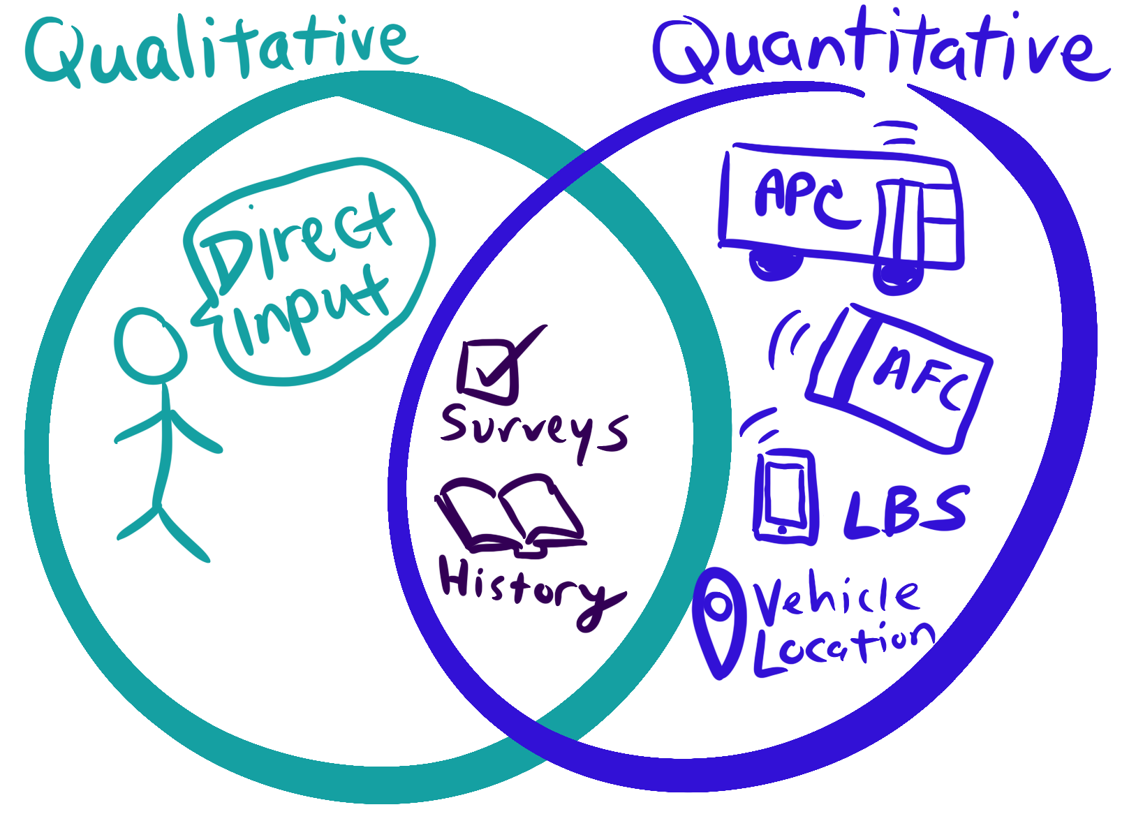
Where do different types of data come from?
Data can come from mechanical and digital automated systems creating a record of an event. For example, every time a train crosses a sensor or a faregate opens. Data also comes from people, whether they answer a survey or share their lived experience at a meeting.
For simplification, we can call these two sources:
![]() Automated Data
Automated Data
and
![]() People Data
People Data
Often automated data is a byproduct of a system designed to do something else (e.g collect fares). The systems have to be maintained and the data cleaned for the data to be accurate. Some examples of automated data:
| Acronym | Source | How is it collected? | What does it record or measure? | What does it miss? |
|---|---|---|---|---|
| AFC | Automated Fare Collection | Fare collection system | Records when people pay or use their farecard, can support models to estimate transfers and where people start and end trips | People who ride for free (e.g. children) or don’t interact with the farebox. |
| APC | Automated Passenger Counters | At doors of vehicles | Records number of boardings and departures at stops, used to measure how many people are on a vehicle | Can’t tell who the people are, connect where someone gets on and off, or if they transfer |
| LBS | Location Based Services | Either apps that collect location on cellphones or the usage of cellphones picked up by cell towers | Records movement of phones, used to estimate trip starts and ends on all modes. Can estimate demographics of travelers from demographics of the phone’s home location | People without cell phones or without data sharing (older adults underrepresented) |
| AVL | Automatic Vehicle Location | Sensors on vehicles record its location anywhere from every few seconds to every few minutes | Used to give real-time information and measure reliability, travel time, and other performance measures | Gives no information about people |
Collecting data directly from people requires thought, labor, and resources. Some examples of people data:
| Source | How is it collected? | Examples | Considerations |
|---|---|---|---|
| Direct input | Calls, comments online and in meetings, engagement in formal public processes | Could include qualitative research methods like focus groups or community guided research, or feedback from employees | Can be one way or two way conversations, requires methods for people to participate that work for them. Can be dominated by voices that are not representative, or not most affected. |
| Surveys | Uses a sample to try to confidently approximate the results for a larger group | US Census or large federal/state travel surveys, transit agency surveys to collect demographics or community feedback | Has to ask the right question to get useful information. Requires enough people to answer the surveys that are representative of the larger population or can be weighted to the larger population using different data. |
| Historical accounts | Transportation and impacts on communities is documented in qualitative and quantitative research | Community narratives, past plans and policies, research studies, budgets | Often not considered data, but it should be. History helps us set our values and goals, and learn what to expect as outcomes from decisions. |
How can different types of data be analyzed?
There are different data analysis methods for qualitative and quantitative data. Agencies should use both types of analysis.
![]() In general, automated
data is quantitative
In general, automated
data is quantitative
![]() Most, but not all, people data is qualitative
Most, but not all, people data is qualitative
Quantitative: Data that can be expressed as a number, specific time or location. Generally can be used in analysis with little processing, but that can lead to meaningless answers.
Qualitative: Data that can’t easily be expressed or reduced to a number, provides qualities, descriptions, and characteristics. With processing, some qualitative data can be sorted into categories (e.g. gender) or topics (area of concerns with complaints) that can be used in quantitative analysis.
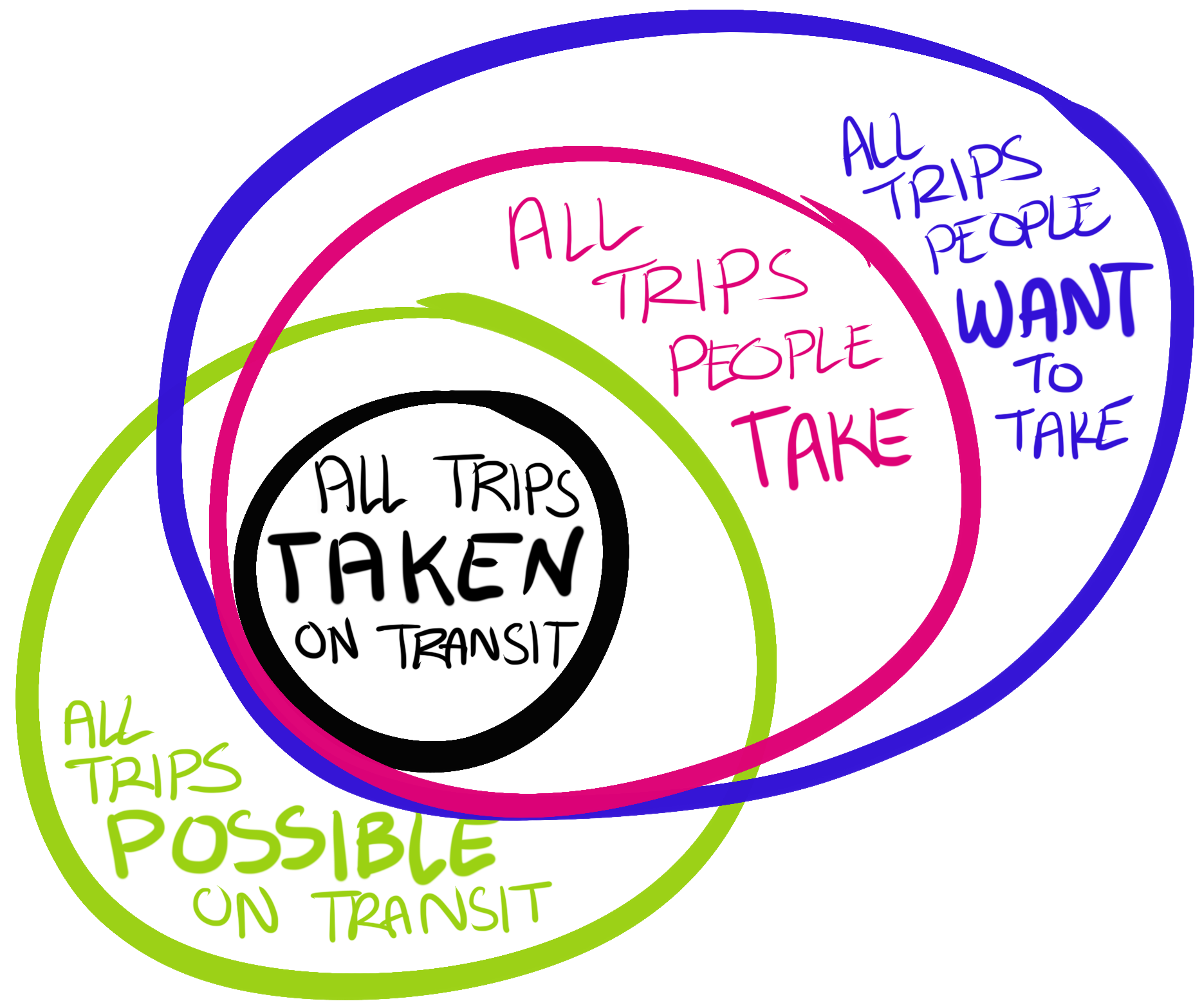
What is the data universe?
To know what dataset to use and how to analyze it, we need to know the universe of data for our question.
For example, are we interested in all transit trips in a time period or all transit riders traveling (since people take multiple trips)? Often the data we want doesn’t exist and we have to use a proxy universe (e.g. use all trips instead of all riders).
The universe provides a unit of analysis and helps us understand how to interpret the results.
What types of questions do different datasets answer?
What transit dataset can answer what questions depends on the type of questions and the universe or unit of analysis we are considering.
Questions/Universe |
Trips on transit | Trips on all travel modes | Trips not taken |
|---|---|---|---|
|
People
|
Surveys, direct input, fare collection as a proxy (e.g. senior farecards) | Surveys, direct input | Surveys, direct input |
|
Places
|
Passenger counters measures starting place, ending place from fare collection with models or tap-out | Location based service data, Demand Models* | Surveys, direct input |
|
Times
|
Fare collection, passenger counters | Location based service data | Surveys, direct input |
|
Performance
|
Depending on what type, can be measured with automated data, surveys, and direct input | Surveys, direct input |
People data is always needed to understand the trips not taken.
Analysis Considerations
The Data Analysis Process
It is hard to find patterns when looking at all the data at once. The analysis process is complicated and analysts have to make a lot of decisions to figure out how to represent the data in ways that we can understand. These decisions are critical and can change the outcomes. The types of decisions are different for quantitative and qualitative data. This website focuses on decisions in quantitative methods.
An important part of this process is being clear on the question we are trying to answer upfront. The question should drive what data is used, not the other way around.
This feels wrong!
It is totally appropriate to have feelings about data. Here are some questions to ask to figure out why results might seem wrong.
Example: A transit agency decides to remove cash payments onboard buses. The agency says 8% of trips on buses are paid in cash onboard based on fare collection data.
| Problem | Question | Using the example |
|---|---|---|
| The question is wrong | Is this analysis answering the question I want answered? | The analysis answers the question of what percent of trips are paid in cash and you want to know what percent of riders will be impacted. These are different universes. |
| The wrong data is used | Is the question right, but the data being used is the wrong data to answer this question? | The analysis of percent of trips paid in cash uses survey data that only includes cash payments, not cash added to a farecard onboard. So gets a lower number. |
| The data is wrong | Is the data (or data analysis) wrong? | The data analysis didn’t include people who pay in cash and didn’t put in the full amount, so gets a lower number. Or there is missing data from fareboxes. |
Given that data is often a proxy and can get very messy, data analysis usually produces estimate with varying levels of accuracy. Here are some question to ask to address inaccuracy.
| Questions to ask | Using the example |
|---|---|
| How different does the result need to be for the outcome or decision to be different? Does the range where analysts feel confident about the data includes values where you would make a different decision? | This is a values decision, but can be framed as what percent of trips would change the decision and what percent of trips requires alternatives to be offered? |
| If the data is wrong, what is the likely direction of the error? Meaning how should the possibility for error impact the decision-making? | The data analysts should be able to tell if they are missing data if it likely to make the number bigger or smaller. For example, if there are errors it is likely to undercount cash users at a higher rate than overall trips. So the number could be higher. |
| What additional data sources can be used to check these results? What other ways are there to look at the data? | For example, where are the bus stops where cash is added, can we break the data down by reduced fare users, what time of day is cash used, do we have survey data of cash users? |
What is the denominator?
To understand a number, we need to know what it is being compared to. Is 800 big or small, that depends on ‘out of what?’ What is the denominator?
We also need the denominator to understand a percentage. In the cash example, does 8% of trips are paid in cash onboard mean 100 trips a day or 10,000 trips a day?
Often the denominator is our universe. In the example, the universe is the total number of trips on buses in a day (or some time period).
Averages
A very common way to report on a dataset is to calculate an average. An average is one way to represent the middle of a dataset.
When the data is distributed fairly normally averages tell us something useful.
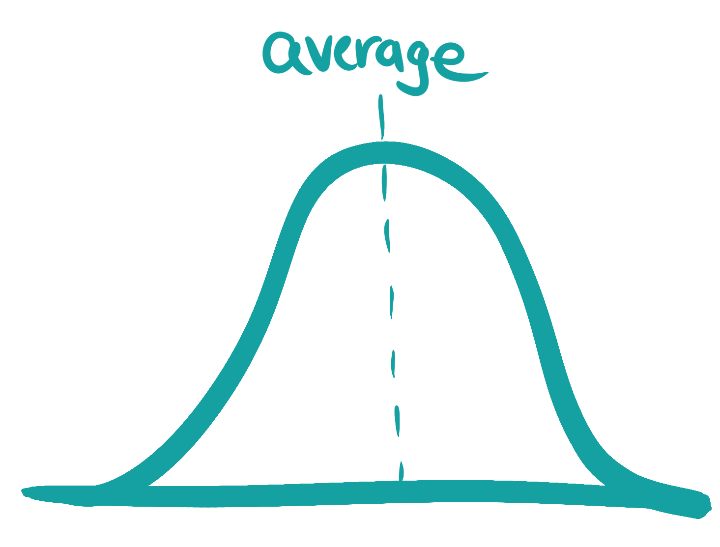
When the data isn’t distributed normally, the average can hide what the data tells us.
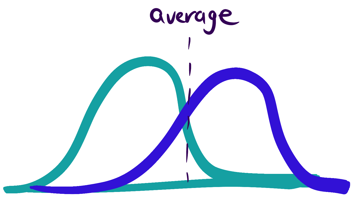
We have to check to make sure the data doesn’t show multiple groups with different experiences or behaviors that should be considered separately.
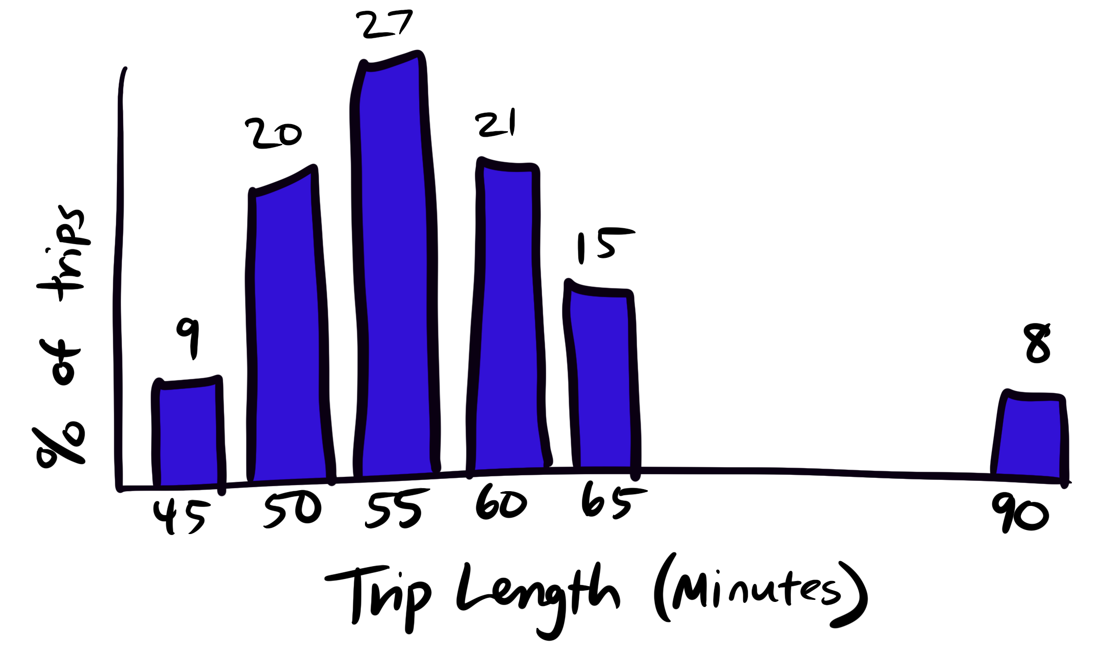
Outliers
In data speak, we call data that is far from the rest of the dataset an outlier, but that doesn’t mean it isn’t important.
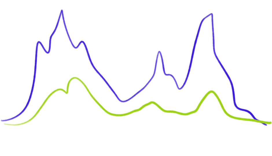
Example: Planners use the travel time of each bus trip on a route to plan the schedule. It might usually take the bus 50-60 minutes and 8% of the time take over 90 minutes. It makes sense to plan for 60 minutes and try to reduce the 90 minute trips.
In our example of removing onboard cash payments, the 8% of all trips paid in cash matter the most.
| Payment Method | Percent of Bus Trips |
|---|---|
| Fare Card | 72% |
| Fare Ticket | 20% |
| Cash Onboard | 8% |
A bus being late only 8% of the time could be considered good service. But in a decision that impacts access to service, 8% is big. It requires additional data to understand who is taking those trips, why they are paying cash, and how the decision would impact them.
Depending on the question we are asking, the outliers in the dataset might matter the most!
In order to make sense of a lot of data we have to combine it into categories. How someone defines the categories can be critical to what pattern is seen.
Looking at the difference between groups or places or times of day is important for equity determinations and to see patterns.
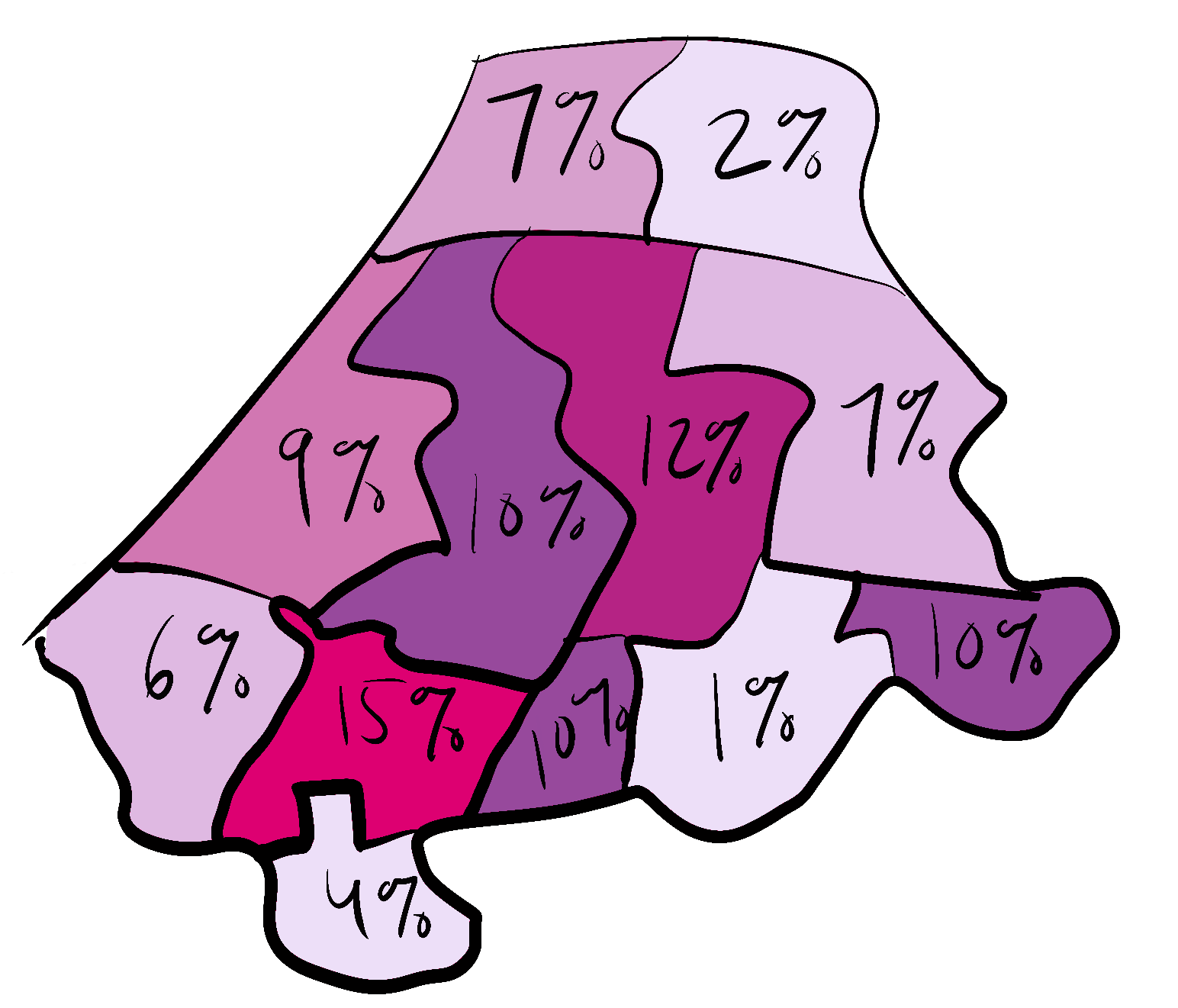
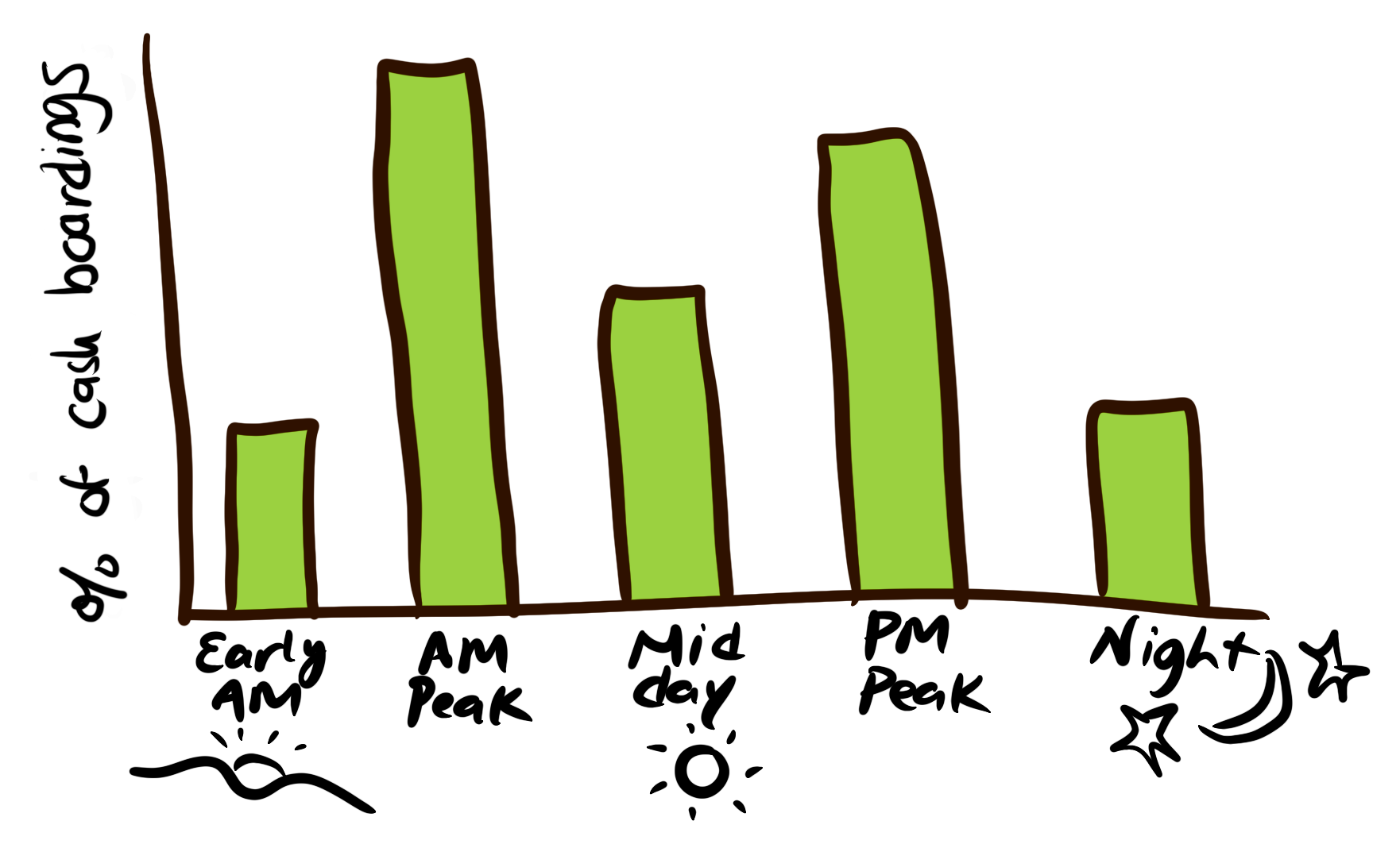
Back to our example for cash onboard, we can look at the data by geography, time of day, and demographics.
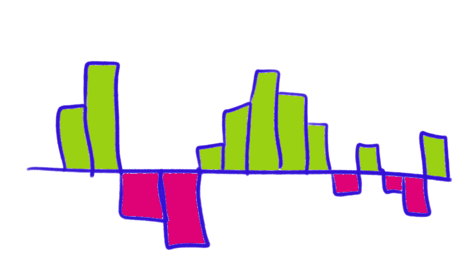
Aggregation by Geography
Aggregation by Time of Day
Aggregation by Demographic Category
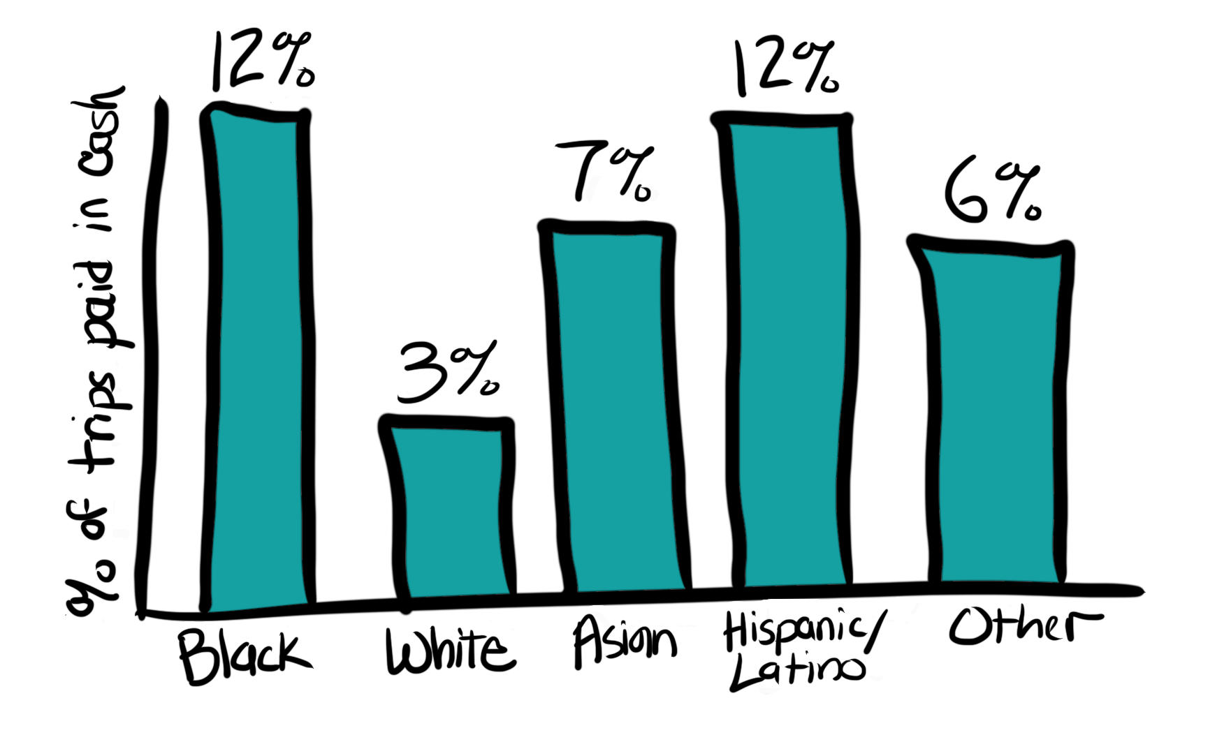
Note: the universe for these examples are different (all boardings, all cash boardings, all trips).
The categories and universe for the data aggregation matters!
Ask for disaggregate data or to see the aggregation multiple ways.
Sample and population data
It is important to know whether a dataset is a population or a sample. This can depend on the question or universe we are considering. For example, fare collection data could be the population of all fare payments, but a sample of all trips since some trips aren’t paid for (e.g. children).
| Dataset | Description | Example |
|---|---|---|
| Population | Contains all of the data in the universe we are considering | An AFC dataset could contain data on all fare payments |
| Sample | Only some of the data in the universe is available | A survey of some members of the universe (e.g. all transit riders) |
When data is a sample we have to consider whether it is representative of the population in order to be able to make statements about the population overall. Samples can be weighted (or scaled) using a population dataset (e.g. Census data) to make them representative on important variables. Sometimes groups need to be ‘oversampled’ (e.g. have more surveys collected) in order to make sure the data is representative.
Targeted Sampling
There are questions where a small group might experience transit differently and we need a targeted data collection or analysis method to make sure they show up in the data. For example, people with disabilities, cash payers, or people traveling late at night could be impacted differently by a decision and a survey of all transit riders might not pick up this difference. This requires different data collection, like direct outreach, that focuses on gathering data from this group in greater numbers compared to a representative sample.
What type of sample we need depends on the question we are asking.
| Sample Type | Data collection | Types of questions |
|---|---|---|
| Representative | Make sure population is reflected in the dataset on variables important for the question, might require oversampling | Questions about the difference in impact/experience across groups or overall impact/experience, and demographics |
| Targeted sample | Focus data collection on some people (or experiences) because those groups aren’t representative, but matter the most for the question or decision | Questions about the specific impact/experience or degree of impact/experience of some groups |
Population datasets can help with targeted sampling because they include all the data. When gathering data directly from people, it is usually impossible to talk to everyone. A dataset like fare collection allows analysts to focus on groups that don’t make up the majority. For example, data on riders paying in cash can be examined to see if they have different travel patterns or to find locations and times of day to do surveys while they are riding.
A note on qualitative analysis
Transit agencies and community organizations should work together to collect and analyze more people data using qualitative methods. This requires different analysis skills and data storage and sharing systems than automated datasets.
Transit agencies need to invest in collecting people data (including paying people providing data), hiring staff to do qualitative analysis, and including qualitative data in open data efforts to make data more available to the public and other decision-makers.
Major Takeaways
- Decision-making can’t start with
 automated data, it has to start with values and
 people data.
 - There are many important questions that can’t be answered with
automated data, especially trips not taken and performance measures
like safety.
- Performance measures need a people data definition of what is good or
passing.
- Data analysis can be wrong (or be answering a different question) and it is useful to know what questions to ask to figure out what went wrong and how inaccuracies matter.
- Important to consider when data needs to be disaggregated and by what type of variables or demographics.
- Need to know when a small number is really important and when a group of people’s experiences could be lost in the overall data and need to be the focus of targeted data collection and analysis.
- Transit agencies need more qualitative data collection, analysis, and data sharing.